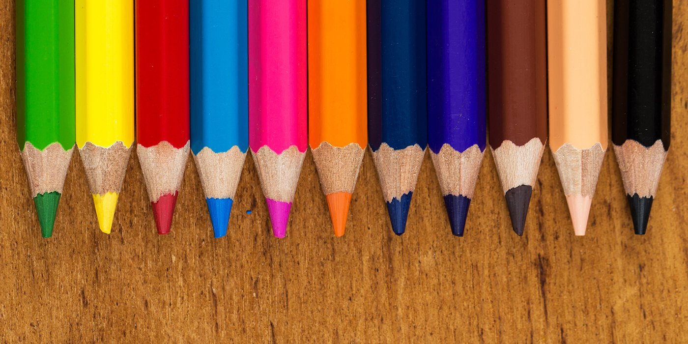
The elements and principles of art and design are the foundation of the language we use to talk about art. The elements of art are the visual tools that the artist uses to create a composition. These are line, shape, colour, value, form, texture, and space.
The principles of art represent how the artist uses the elements of art to create an effect and to help convey the artist’s intent. The principles of art and design are balance, contrast, emphasis, movement, pattern, rhythm, and unity/variety. The use of these principles can help determine whether a painting is successful, and whether or not the painting is finished.
The artist decides what principles of art he or she wants to use in a painting. While an artist might not use all the principles of design in one piece, the principles are intertwined and the use of one will often depend on another. For example, when creating emphasis, the artist might also be using contrast or vice versa. It is generally agreed that a successful painting is unified, while also having some variety created by areas of contrast and emphasis; is visually balanced; and moves the viewer’s eye around the composition. Thus it is one principle of art that can influence the effect and impact of another.
The 7 principles of art
Balance refers to the visual weight of the elements of the composition. It is a sense that the painting feels stable and “feels right.” Imbalance causes a feeling of discomfort in the viewer.
Contrast is the difference between elements of art in a composition, such that each element is made stronger in relation to the other. When placed next to each other, contrasting elements command the viewer’s attention. Areas of contrast are among the first places that a viewer’s eye is drawn. Contrast can be achieved by juxtapositions of any of the elements of art. Negative/Positive space is an example of contrast. Complementary colors placed side by side is an example of contrast. Notan is an example of contrast.
Emphasis is when the artist creates an area of the composition that is visually dominant and commands the viewer’s attention. This is often achieved by contrast.
Movement is the result of using the elements of art such that they move the viewer’s eye around and within the image. A sense of movement can be created by diagonal or curvy lines, either real or implied, by edges, by the illusion of space, by repetition, and by energetic mark-making.
Pattern is the uniform repetition of any of the elements of art or any combination thereof. Anything can be turned into a pattern through repetition. Some classic patterns are spirals, grids, weaves. For examples of different pattern types see the Artlandia Glossary of Pattern Design. A popular drawing practice is Zentangles, in which an abstract or representational outline is divided into different areas, each of which contains a unique pattern.
Rhythm is created by movement implied through the repetition of elements of art in a non-uniform but organized way. It is related to rhythm in music. Unlike pattern, which demands consistency, rhythm relies on variety.
Unity/Variety You want your painting to feel unified such that all the elements fit together comfortably. Too much unity creates monotony, too much variety creates chaos.You need both. Ideally, you want areas of interest in your composition along with places for your eye to rest.
If you use these principles to the hilt, you too can achieve an outstanding piece of art just like this eye-poping pencil drawing done using DOMS products.

